
📺 Watch the Full Video Analysis
This article was automatically generated by the NFC Market Live AI analysis system. (Updated: 2026-09-12 07:10 JST)
📄 Primary Source
米国労働省(DOL)— 新規失業保険申請件数
https://www.dol.gov/newsroom/releases/eta/eta20260910
米国エネルギー情報局(EIA)— 週間石油状況レポート
https://www.eia.gov/petroleum/supply/weekly/pdf/highlights.pdf
連邦準備制度理事会(FRB)— H.4.1 バランスシート
https://www.federalreserve.gov/releases/h41/current/h41.htm
Breaking down this week’s 3 major US macro releases (Sep 10, 2026) 📊
Initial jobless claims held at a historically low 206,000, signaling labor market resilience 📈
But WTI crude surged over $8 in a week to $92.69, with distillate inventories 13% below the 5-year average ⚠️
The Fed’s balance sheet grew year-over-year, hinting QT may be stalling 💡
Labor, energy, and liquidity data are sending mixed signals this week — here’s the strategist-level breakdown.
今週のアルティメット・サマリー:交差する強さと弱さ
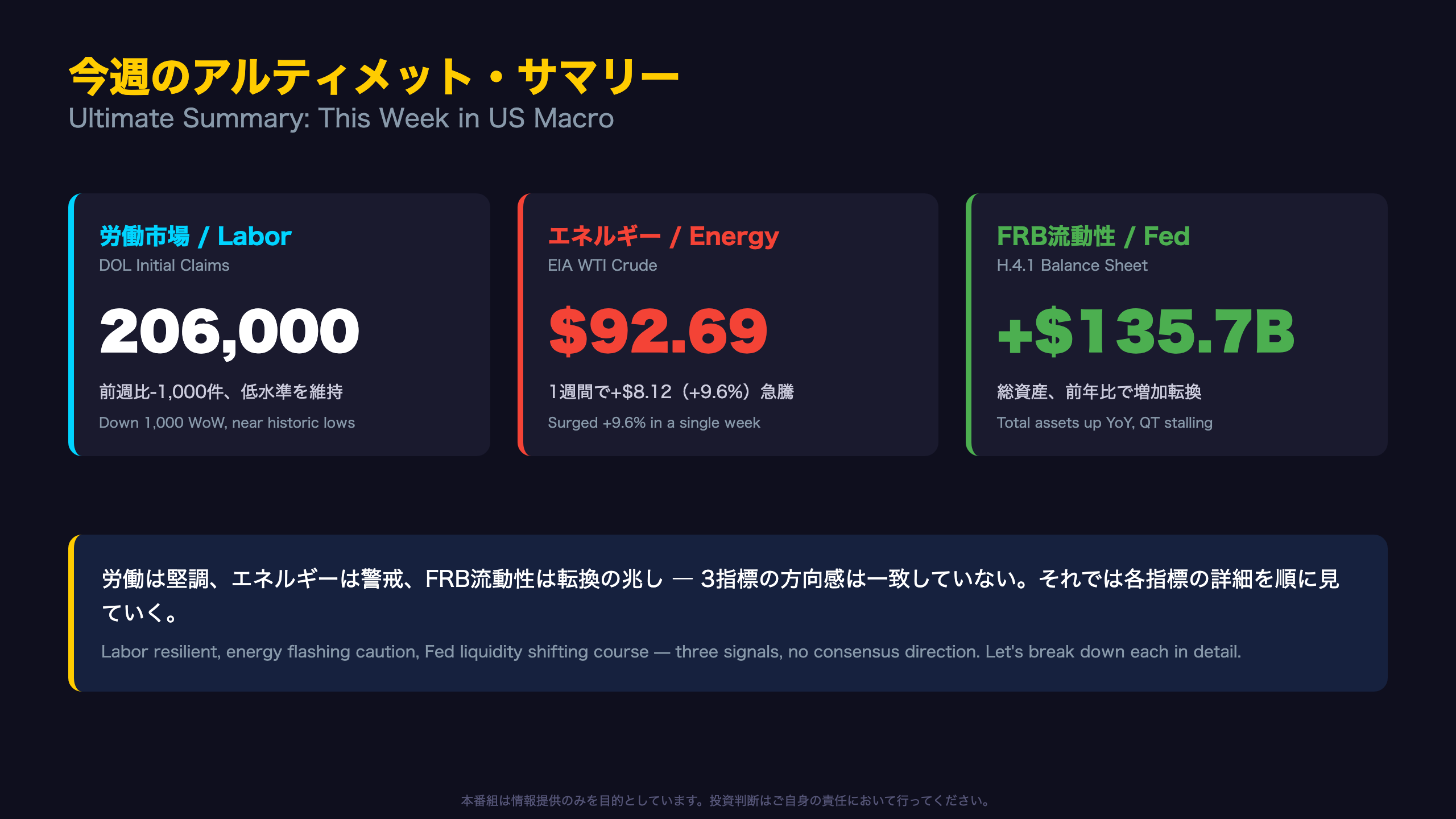
This Week’s Headline: Three Diverging Temperatures
Three major US macro releases landed around September 10. At first glance, the story looks like the familiar template — “labor market stable, inflation a bit worrying” — but the underlying picture is more nuanced.
Historical Context
The four-week moving average of initial jobless claims stands at 206,000, roughly 11% below the same period last year (230,500 as of August 30, 2025). Throughout 2026, claims have mostly held in a 200,000-220,000 range — a level historically associated with a tight labor market.
WTI crude, however, jumped from $84.57 to $92.69 in a single week, an $8.12 (+9.6%) move that stands out even against a year of volatile energy prices. For context, US CPI reports typically treat a single-week 9%+ move in crude as a meaningful upside risk to headline inflation in the following month or two.
The Hidden Storyline: The Fed’s Balance Sheet
According to the Federal Reserve’s H.4.1 report, total factors supplying reserve funds (roughly equivalent to total assets) rose $135.7 billion year-over-year. Given that the Fed has been conducting quantitative tightening (QT) — shrinking its balance sheet — a year-over-year increase is a signal worth flagging. Whether this reflects a durable shift or a temporary fluctuation (e.g., driven by swings in the Treasury General Account) remains to be seen in coming weeks.
The key takeaway this week is not any single number — it’s that labor, energy, and Fed liquidity data are not all pointing in the same direction.
労働市場の現在地:新規失業保険申請
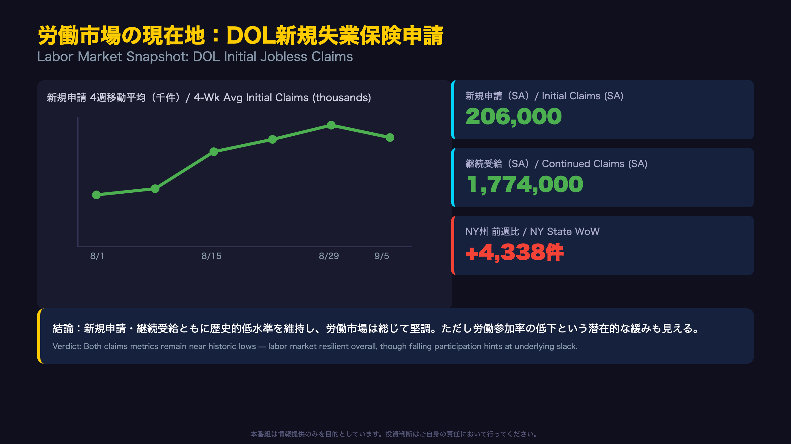
Beneath the Headline: The Real Temperature of the US Labor Market
At 206,000, initial jobless claims might look unremarkable in isolation, but the year-over-year trend tells a clearer story: claims have fallen roughly 13% from 236,000 a year ago (week of August 30, 2025) to 206,000 now. Continued claims followed a similar pattern, down about 8% from 1,927,000 to 1,774,000.
A State-Level Outlier
New York posted the largest single-state increase in the nation, up 4,338 claims week-over-week. The state’s own comment attributes this to “layoffs in transportation and warehousing, health care and social assistance, and educational services industries.” This is a single-week data point and should not be read as a structural trend, but it’s worth monitoring in coming releases.
A Different Signal From Extended Analysis
Separately, HMM-based regime analysis flags the labor force participation rate at 61.6%, a full 3.04 standard deviations below the current regime’s centroid of 62.7% — the largest anomaly in this week’s dataset. This is a monthly BLS metric, distinct from DOL’s weekly claims data, but it highlights an important nuance: while the “flow” indicator (new claims) looks resilient, the “stock” indicator (participation) may be showing signs of labor force exit.
For US investors used to watching claims alone, this divergence between flow and stock metrics is the kind of detail that rarely makes headlines but matters for assessing labor market slack — a key input the Fed watches when weighing rate policy.
The next DOL initial claims report is scheduled for release next Thursday.
エネルギー需給の現在地:EIA週間石油統計
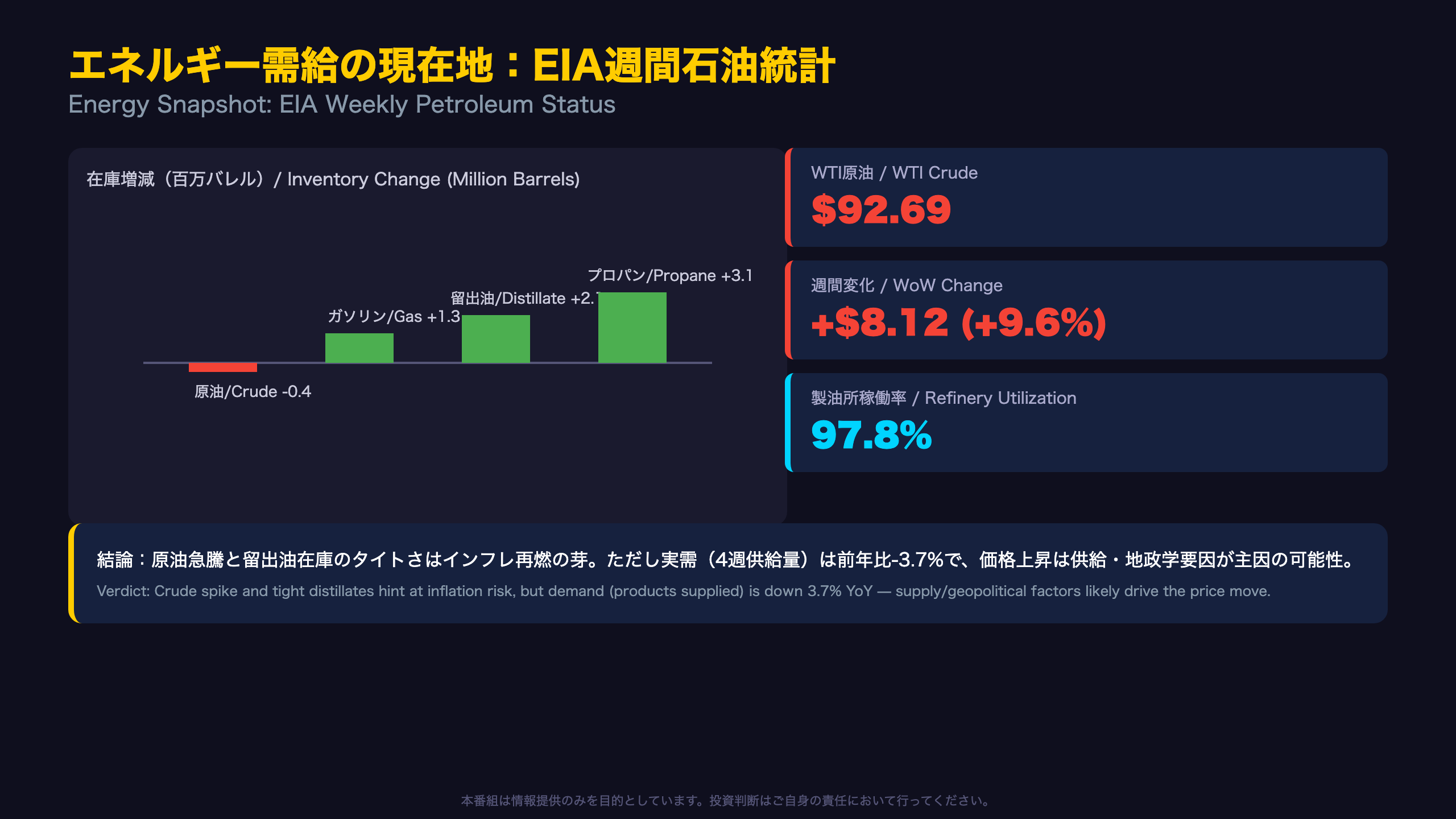
The Twist Behind This Week’s Crude Spike
The standout surprise this week is WTI crude’s $8.12 (+9.6%) jump to $92.69 a barrel — up roughly 49% from $62.22 a year ago. For US and global investors, this kind of single-week move is unusual even in a historically volatile energy market.
What Inventories Really Tell Us: It’s a Supply Story, Not a Demand Story
The crucial nuance: crude oil inventories themselves are essentially unchanged at 424.1 million barrels, matching the five-year seasonal average — a fairly “normal” reading. Distillate (diesel/heating oil) inventories, however, remain a genuine outlier at 13% below the five-year average even after a 2.1 million barrel weekly build. Propane inventories sit at the opposite extreme, 27% above average. This patchwork of tightness by fuel type — not a broad crude shortage — is the more accurate read on US energy markets right now.
As the EIA’s own release states: “Distillate inventories increased 2.1 million barrels, 13% below the five-year average” — confirming that even a weekly build hasn’t closed the structural gap.
Demand Is Actually Softer Than Last Year
The four-week average of total petroleum products supplied — the EIA’s proxy for domestic consumption — came in at 20.1 million barrels/day, down 3.7% year-over-year. Gasoline demand is down 1.4% YoY and distillate demand down 2.6% YoY. This suggests the price spike likely reflects supply-side or geopolitical drivers rather than a demand-led boom (a moderate-confidence read, given this is single-week data).
Retail Pass-Through Has Been Limited So Far
Retail gasoline rose only $0.086 a gallon — a fraction of crude’s 9.6% jump — while diesel rose a steeper $0.368, showing uneven pass-through speed by fuel type. For context, US CPI’s energy component tracks retail prices, not spot crude, so this lag matters for how quickly the crude spike could show up in next month’s CPI print.
The next EIA Weekly Petroleum Status Report is due next Wednesday, with retail gasoline pass-through the key variable to watch.
FRB流動性の現在地:H.4.1バランスシート
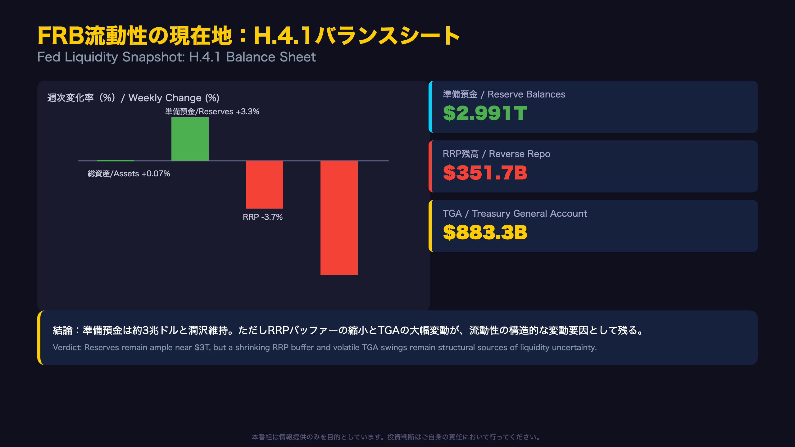
A Quiet Shift in the Fed’s Balance Sheet
The most easily overlooked but arguably most important detail in this week’s H.4.1 release: total factors supplying reserve funds rose $135.7 billion year-over-year. The Fed has officially been running quantitative tightening (QT), shrinking its balance sheet — so a year-over-year increase, even a modest one, is worth flagging for anyone tracking the path of QT.
Reserves Remain Ample, But Volatile
Reserve balances jumped $96.8 billion week-over-week to $2.991 trillion — still comfortably within the range the Fed and market participants generally consider “ample.” Yet year-over-year, reserves are down $169.5 billion, meaning a short-term bounce coexists with a longer-run declining trend. For readers unfamiliar with the H.4.1 report: it is the Fed’s weekly balance sheet statement, roughly analogous to a company’s balance sheet but for the central bank, tracking assets (securities held) against liabilities (currency, reserves, RRP, TGA).
The Reverse Repo Facility: A Shrinking Safety Valve
The overnight reverse repo (RRP) facility — where money market funds and others park excess cash with the Fed — fell to $351.7 billion, down both week-over-week and year-over-year. Compared to its peak above $2 trillion in prior years, RRP’s role as a buffer absorbing excess system liquidity has diminished substantially. As RRP shrinks toward zero, fluctuations in Treasury cash management (the TGA) transmit more directly into bank reserves — a dynamic US money-market analysts watched closely during the 2019 repo squeeze.
The TGA Swing Worth Watching
The Treasury General Account (TGA) — the government’s checking account at the Fed — fell $84.6 billion to $883.3 billion from $967.9 billion the prior week. Regime-based anomaly detection flags that the prior week’s TGA level was more than double the model’s typical centroid ($417 billion), underscoring how historically elevated this balance has been.
As stated in the H.4.1 release: the Treasury General Account fell $84.6 billion week-over-week but remains $211.1 billion above a year ago.
For global macro investors, TGA drawdowns effectively inject liquidity into the banking system (reserves rise), while TGA rebuilds (often following heavy Treasury bill issuance) can drain it — a dynamic that matters for repo rates and short-term Treasury yields, distinct from the ECB or BOJ’s balance sheet mechanics.
The next H.4.1 release is due next Thursday.
ストラテジスト総括:3指標の連関と来週の注目シナリオ
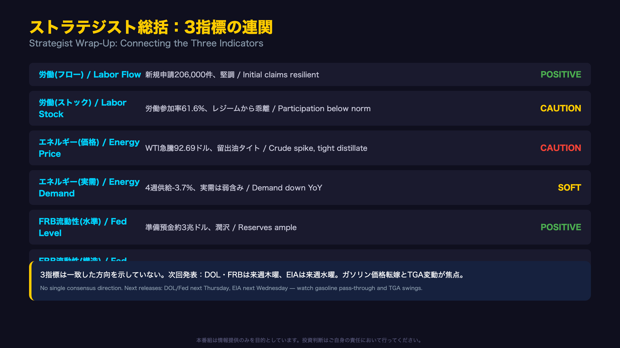
Connecting the Dots Across Three Indicators
Viewed together, this week’s data resists a simple bull/bear label. Instead, it presents a genuinely mixed picture across labor, energy, and liquidity.
Where the Signals Diverge
| Category | Signal | Read |
|---|---|---|
| Labor (flow) | Initial claims at 206,000 | Resilient |
| Labor (stock) | Participation rate 61.6% vs. 62.7% regime norm | Softer |
| Energy (price) | WTI +9.6% WoW, distillates tight | Inflation caution |
| Energy (demand) | 4-wk supply -3.7% YoY | Soft demand |
| Fed liquidity (level) | Reserves ~$3T | Ample |
| Fed liquidity (structure) | RRP shrinking, TGA volatile | Structural risk |
The defining feature of this week’s release cycle is that even within a single category, the “level” and the “quality of change” tell different stories — a nuance that a single-number headline print can easily obscure.
What the Extended Regime Analysis Adds
A separate HMM-based regime model (as of September 25, 2026) shows the current regime unchanged for five consecutive weeks, with centroid distance stable — suggesting no imminent regime shift. However, several underlying indicators — labor force participation (Z=3.04), the Treasury General Account (Z=2.08), and currency in circulation (Z=2.04) — show notable deviation from their typical regime values. In other words, the overall regime looks stable, but some of its individual components are behaving atypically, a nuance worth monitoring in subsequent releases (this reflects a separate, model-based dataset distinct from the DOL/EIA/FRB releases themselves).
Two Risk Scenarios to Watch
- Inflation pass-through scenario: If crude’s spike feeds through more fully into retail gasoline and diesel prices, upcoming CPI/PCE prints could face modest upside pressure — a dynamic the Fed would likely weigh alongside labor market data at its next policy meeting.
- Liquidity volatility scenario: Continued large swings in TGA drawdowns and rebuilds could translate into more volatile short-term funding costs (e.g., SOFR, repo rates), a dynamic reminiscent of past year-end and debt-ceiling-related funding squeezes in US money markets.
This program is for informational purposes only and does not constitute investment advice.
Disclaimer: This article is for informational purposes only. All investment decisions are made solely at your own risk.